Analysis of single-cell RNA-seq data, Part 1
Author: Marin Truchi
Analysis of single-cell RNA-seq data, Part 1
Primary analysis, from FASTQ files to count matrices
Like all Illumina paired-end sequencing, the sequencing of single-cell RNA-seq libraries generates 3 types of reads divided into as many FASTQ files. These 3 types of reads are linked by a unique identifier which is their header, and are each associated with a quality score. If several sequencing libraries have been multiplexed on the same flow cell, the “I1” reads files contain the index inserted during preparation to distinguish each library. The demultiplexing step assigns each triplet of reads to the different samples, or to a single sample if only one library has been sequenced. “R2” reads correspond to the 91 base pairs sequenced from the 3’ end of the cDNA molecule of the captured transcript. This sequence is aligned with the species’ reference genome or transcriptome to assign the read to a gene. “R1” reads encode 16 base pairs corresponding to the cellular barcode and 12 base pairs corresponding to the molecular barcode. This molecular barcode, called UMI (Unique Molecular Identifier), uniquely identifies each RNA captured before the PCR amplification step. Final quantification consists of counting the number of unique UMIs assigned to a single gene. In this way, quantification biases induced by uneven PCR amplification cycles are minimized. The cell barcode links each read to a droplet and, by extension, to the encapsulated cell. RNA molecule count matrices for each gene in each cell are thus obtained from the combined reads of R1 and R2 reads sharing the same identifier.
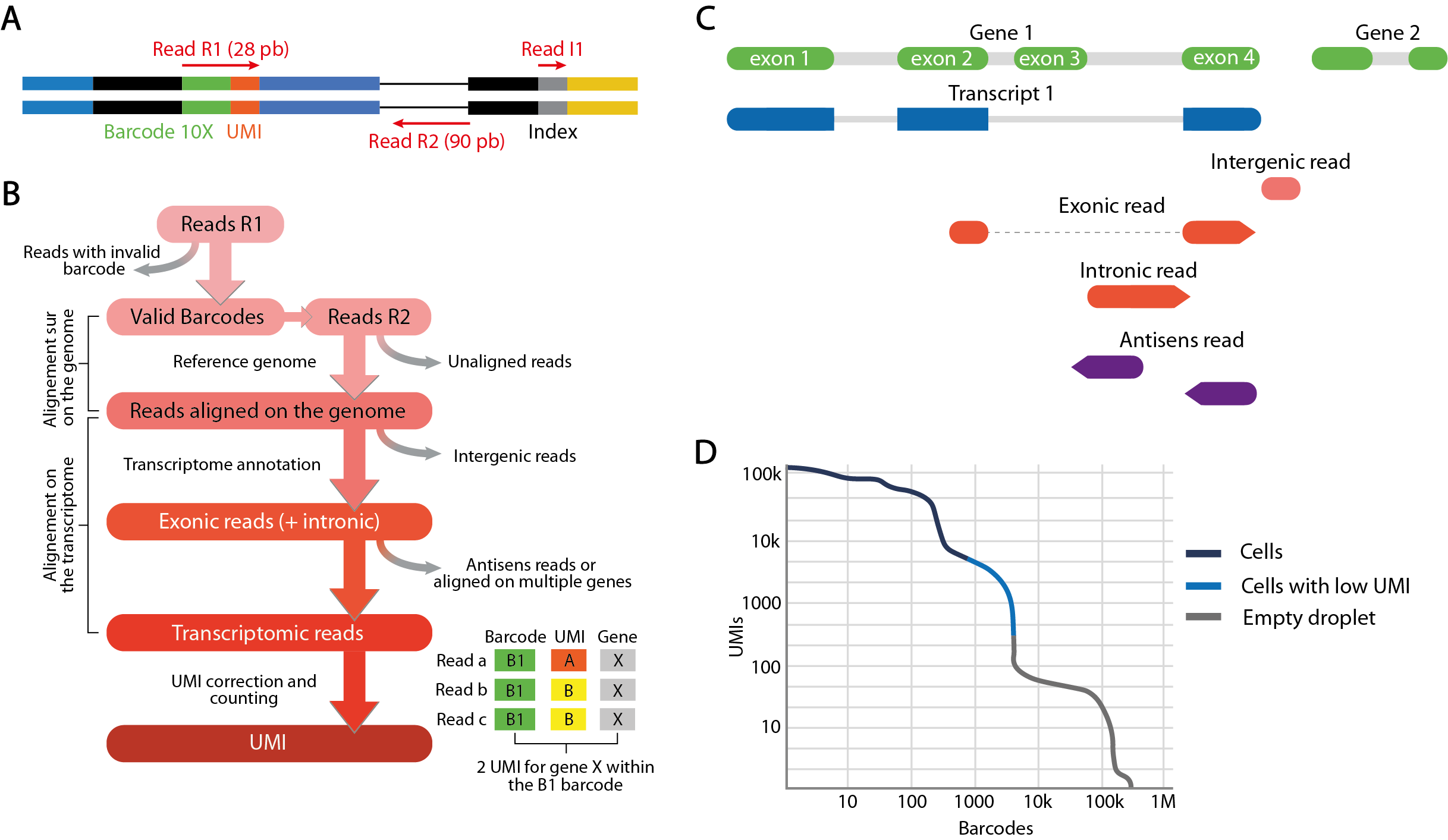
This quantification of transcripts is carried out by different pipelines combining several analysis tools, notably the cellranger pipeline developed by 10X Genomics. Cellranger uses STAR alignment software to align “R2” reads to the reference genome. Unaligned reads or reads with poor alignment quality are discarded. In addition, transcriptomic annotations are used to define the proportion of exonic reads, i.e. reads that align with exons over 50% of their length at least, as well as intronic and intergenic reads. If reads aligned to intergenic regions are eliminated, an option is provided to include reads confidently aligned to intronic regions. Considered as those confidently aligned to the transcriptome, the remaining reads are quantified by counting UMIs.
The final objective is to use this UMI quantification to identify barcodes corresponding to droplets in which a cell has been captured, and eliminate those corresponding to empty droplets likely to increase the noise. The final count matrix summarizes the gene expression profiles detected in the filtered barcodes and forms the starting point for the secondary analysis.
Each primary analysis produces a summary of the various metrics calculated during the process. These metrics include the estimated number of barcodes corresponding to captured cells, their average number of reads and UMI, the percentages of reads sequenced from these cells or from empty droplets, and the distribution of reads between exonic, intronic and intergenic regions. Another interesting metric is sequencing saturation, which measures the percentage of unique transcripts detected relative to their total number estimated for the library. This estimate depends both on the sequencing depth initially allocated, and on the complexity of the transcriptome of the studied cell populations. Low saturation means that further sequencing of the library may be beneficial to increase the number of UMI detected. These metrics are therefore particularly informative for an initial evaluation of the quality of the generated data.
Secondary analysis, from count matrices to clustering
Characteristics of count matrices
The count matrices summarizing gene expression for each barcode assigned to a cell have particular properties that determine the analysis workflow. Firstly, they are high-dimensional data: for several thousand barcodes, around 30,000 genes are quantified. However, the overwhelming majority of matrix elements are zero or near-zero counts, due to several factors.
Firstly, this is due to the tiny quantities of molecules that can be detected on a single-cell scale, and to the low sequencing depth resulting from the distribution of a finite number of reads across several thousand cells. It is also due to the biological variability of the tissue under study, which involves regulatory mechanisms specific to each population, which do not all express the same genes. Moreover, the processes leading to gene expression follow discontinuous and desynchronized dynamics between cells, of which sequencing only captures a snapshot. On top of this biological variability comes the technical variability induced by the stochastic nature of RNA capture. Only a fraction of all cellular transcripts are captured (around 10% with 10X Genomics’ droplet-based cell isolation protocol), and not all molecules have the same probability of being captured. This probability depends in particular on transcript stability, subcellular localization and sequence.
Due to these many factors, scRNA-seq data are characterized by significant intercellular variability. The main challenge of secondary analysis is therefore to process the data in such a way as to extract the biological signal of interest, while minimizing other sources of unwanted or uninformative variability.
Step 1 - Quality control
The first step in the analysis of count matrices is to perform a quality control in order to filter out barcodes and noise-related genes. As expressed genes in only a few barcodes are not relevant for characterizing the biological heterogeneity of the sample, their elimination is recommended to reduce matrix dimensions and speed up computation time.
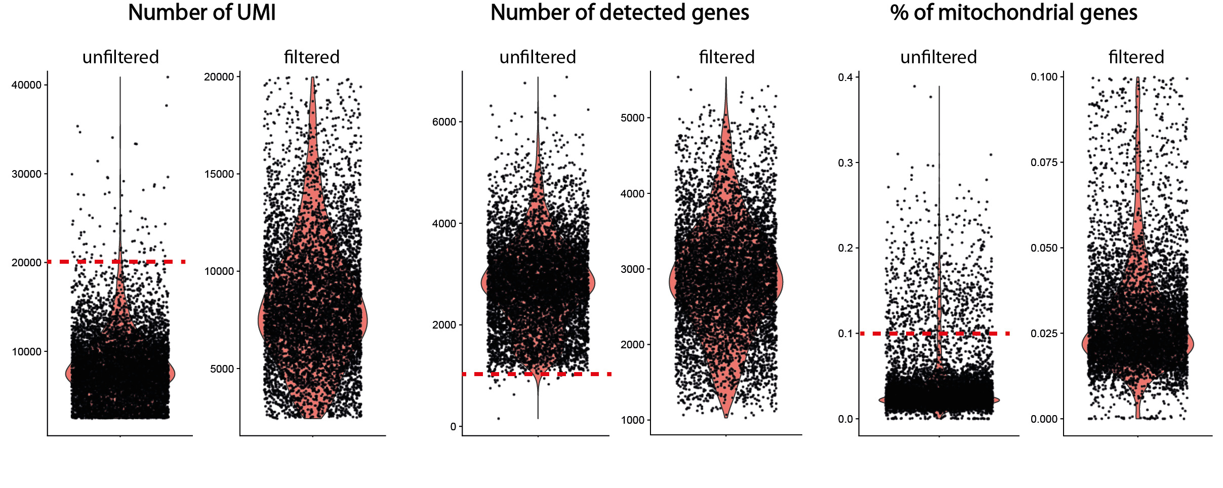
The control of barcodes is even more crucial to reduce the amount of noise that can mask biological variability. If barcodes corresponding to empty droplets have been previously eliminated, the remaining barcodes are likely to represent degraded cells or doublets, which may bias the analysis. Identification of non-viable cells is based on 3 variables calculated for each barcode: their total number of UMI, their total number of unique detected genes and their fraction of counts corresponding to mitochondrial transcripts. An abnormally high fraction of mitochondrial genes is interpreted as the result of degradation of cell membrane integrity, resulting in the loss of cytoplasmic RNA while mitochondrial transcripts are preserved. This potential degradation is also generally materialized by a decrease in the number of UMI counts and the number of uniquely detected genes.
Cells considered to be of poor quality are eliminated by applying arbitrary thresholds based on the distribution of these 3 metrics over the whole dataset. However, some flexibility is recommended in setting these thresholds, to avoid excluding cell types or states characterized by low transcriptomic content or higher levels of mitochondrial transcripts. More generally, quality control should be an iterative process in which the initial parameters are adjusted in the light of the effects observed on the final clustering of cells. Typically, cells grouped according to their UMI content, their high proportion of mitochondrial transcripts, or marked by a stress signature, rather than by the expression of biologically relevant transcripts, are to be eliminated a posteriori.
Another bias to be eliminated at this stage of the analysis is the presence of barcodes corresponding to doublets, i.e. droplets in which at least two cells have been encapsulated. Their frequency increases proportionally with the number of cells profiled (between 5 and 12% of a 5000 to 10000-cell dataset). The over-representation of doublets containing 2 different cell types may lead to misinterpretation, for example as an intermediate state or a rare cell type. While doublets generally have a higher content in terms of number of UMIs or number of genes detected than barcodes associated with single cells, their identification is based on more complex methods. These involve creating artificial doublets by aggregating the profiles of pairs of cells, then integrating them into the dataset, before clustering. The probability of each barcode corresponding to a doublet is then calculated by measuring the proximity between its expression profile and that of the artificial doublets in reduced-dimension space (see for example DoubletFinder).
Step 2 - Normalization
The elimination of barcodes with extreme values, particularly in terms of the total number of quantified UMI, is a necessary first step in denoising the signal. However, in the remaining data corresponding to barcodes considered to be cells in good condition, the fraction of biological heterogeneity remains largely mixed with other variability sources, thus biasing the analysis. The aim of normalizing these data is to deal with two of the confounding factors inherent in the approach, by carrying out 2 simultaneous operations.
The first involves correcting for technical fluctuations in the total number of molecules quantified in each cell. This variability in depth is notably due to differences in the capture, retrotranscription and sequencing efficiencies of their transcripts. Without correction, this unwanted signal is likely to represent a predominant part of the variance used for dimension reduction, the key step on which clustering and data representation are based. Cells will then tend to cluster according to their average depth rather than by similarity of expression of genes specific to their functions or a biological condition. Comparing transcript abundance between cells also risks producing false positives whose differential expression is linked to depth differences.
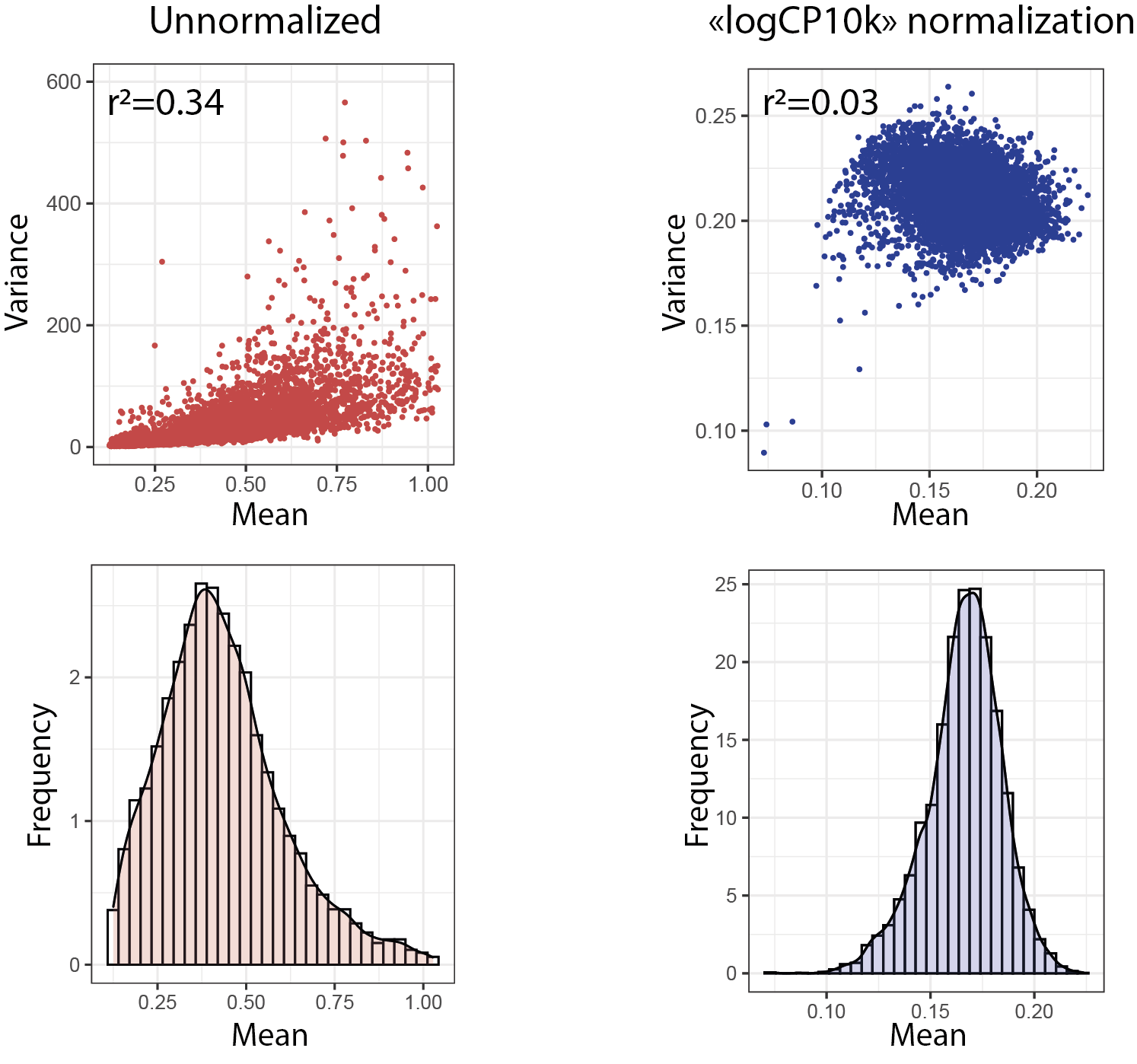
The second operation consists of correcting for data heteroscedasticity, i.e. differences in variance between counts of each gene, in particular between the more highly expressed genes, which show greater dispersion than the less highly expressed ones. This correlation between mean and variance implies that statistical operations based on the detection of variable genes will favor the most abundant genes, regardless of the biological relevance of their variability. To limit this bias, data normalization must be accompanied by a variance stabilization step. Finally, the transformation induced by normalization must be monotonic, i.e. it must retain the importance ranks attributed to each variable in order to remain faithful to biological reality. In this context, various normalization methods have been proposed, but to date their performance has not been considered satisfactory.
The method most widely used by the community is conceptually identical to the CPM normalization used in bulk RNA-seq. It consists in scaling each count by dividing it by the total sum of UMI counts in the cell and multiplying it by a single adjustment factor, e.g. the median of the counts or the power of 10 of the same order of magnitude (usually 10,000). For variance stabilization, normalized data are log-transformed by adding a pseudo-count of 1 to avoid calculating logarithms of zero values. Log transformation reduces the correlation between depth and variance. The reduction in data dispersion thus induced also makes it possible to approximate a normal distribution of counts, an underlying assumption for most statistical analysis tools. Finally, it has the advantage of converting differences in expression into “fold change”, a standard and easily interpretable measure.
Step 3 - Dimension reduction
Data normalization reduces the technical variance. However, the biological signal of interest remains drowned out by the large dimensionality of the data. For example, if all genes are taken into account to establish distances between expression profiles, then all cells will tend to be equidistant from each other. Moreover, of the thousands of genes quantified, only a fraction contribute to the characterization of cell types and states. Selection of informative variables and reduction of data dimensionality are therefore necessary to reduce the signal-to-noise ratio and improve data interpretability.
The selection of informative variables is generally based on the relationship established between the variance and the mean of all normalized counts. Genes whose observed variance is greater than that expected are considered highly variable, and therefore the most likely to describe the heterogeneity of the dataset. The selected highly variable genes are then used for dimension reduction.
The most commonly used approach to dimension reduction is Principal Component Analysis (PCA), described by Karl Pearson in 1901. PCA involves creating artificial variables, called principal components, which correspond to projection axes on which the variance of high-dimensional data is maximized. The sum of the squared distances between the data points projected on the axis and the reference origin is called the eigenvalue. The first principal component is the one with the highest eigenvalue, and subsequent components are ranked in descending order of eigenvalue. Each component is a linear combination of the contributions of each gene to the projection axis it represents. In other words, they are vectors associating a score to each gene, called eigenvectors. PCA offers several advantages. Firstly, the calculation of eigenvectors requires few computational resources and is easily applied to large datasets. In addition, the nature of the eigenvectors facilitates interpretation of the components. Components correlated with markers of cell types and states can thus be directly identified. Similarly, components can be correlated with genes associated with depth differences or other sources of unwanted variability, indicating deficiencies in quality control or standardization. The calculated principal components are the variables on which clustering and data visualization are based. The choice of the number of components to include in each of these operations is empirical, as too few can lead to a loss of information, while too many can lead to technical noise. This choice is based firstly on the fraction of total dataset variance explained by each component, calculated from the eigenvalues of each component. When the inclusion of a new component no longer significantly increases the share of total variance, then its contribution to dataset heterogeneity is probably negligible. In addition, component selection can be based on supervised inspection of the genes that contribute most, so as to retain those with biologically relevant signatures or eliminate those associated with noise.
Step 4 - Clustering
The aim of all the data processing, normalization and dimension reduction procedures described above is to extract the biological signal that enables cells to be grouped according to their transcriptomic profiles, which reflect their functions and responses to their environment. This clustering step is based on the distances between expression profiles in reduced-dimension space to identify communities of similar cells.
The reference clustering method is the “k Nearest Neighbors” (kNN) method. First, the matrix of Euclidean distances separating each cell is calculated, based on their coordinates vector in the reduced n-dimensional space, where n is the number of selected principal components. The calculated distances are plotted as a graph, where each node is a cell. Only the edges of the graph linking each node to its k nearest neighbors are retained. A graph partitioning algorithm, such as Louvain’s, is then used to isolate the nearest cell communities. When the size of the underlying communities is heterogeneous, the algorithm may fail to detect the smallest communities. To remedy this, a resolution parameter can be adjusted to favor the formation of small communities, corresponding, for example, to rare cell types. However, high resolution will tend to split large though homogeneous communities into several subsets whose distinguishing features are generally of little relevance from a biological point of view.
Step 5 - Annotation
The relevance of the identified communities by clustering is assessed during annotation, which is based on the detection of so-called marker genes to associate them with a function, state, response or localization. These markers are identified by testing the difference in mean expression between the cells in each cluster and the rest of the dataset, or by manual inspection of known genes.
Ideally, a biologically relevant cluster has a signature of several dozen markers whose expression is strong, specific and whose functions are known in the literature, so as to identify the associated cell population. In practice, some clusters show high gene expression but which are not particularly specific. This is particularly the case for transient cell states in differentiation processes, which generally display signatures similar to the populations from which they originate, while having lost some of the markers of these specialized populations. Other clusters are characterized by the specific expression of only a few markers, which reduces the chances of this population holding a biological identity of its own. Conversely, a cluster may be marked by a distinct signature of significant size, but which corresponds to unwanted variability. For example, the stress signature induced by enzymatic dissociation at 37° is characterized by the massive expression of genes coding for heat shock proteins and for transcript factors of the immediate early gene family, such as JUN, JUNB, c-FOS, FOSB, ATF3, or EGR140. Moreover, inadequate quality control or standardization leads to the creation of clusters whose signature reflects technical biases, such as an aberrant mitochondrial gene content or mean depth. Finally, when different samples are integrated, clusters specific to a particular sample may stand out due to genes whose detection varies according to sequencing conditions. Similarly, the expression of certain genes is determined by the genetic characteristics of the individual, such as genes whose locus is located on the Y chromosome and therefore specifically detected in males.
A major difficulty in annotation is therefore to link cluster signatures to biologically meaningful labels. As spatial information is lost during tissue dissociation, annotation relies exclusively on empirical knowledge established for the genes of the identified signatures. This knowledge is directly accessible when the analyst or his collaborators are experts in the field. However, it is often the case that certain signatures are not immediately recognized, necessitating a complex and time-consuming bibliographical search. Indeed, despite the constant enrichment of databases listing cell population markers, not all of them are listed in the literature, or these markers are not necessarily applicable to scRNA-seq data. For example, the use of genes identified as markers through their protein, such as surface markers, may prove unsuccessful due to the limited correlation between the two measurements. Moreover, while most of the differentially expressed genes in a population are functionnally-annotated coding genes, these descriptions do not necessarily provide information on cell function. Indeed, these annotations are derived from experiments carried out in a precise context and model, which rarely correspond to that of the experiment leading to sequencing.
Nevertheless, thanks to the exponential increase in the number of manually annotated and published single-cell RNA-seq datasets, numerous automatic annotation methods leveraging these resources are now available and represent an interesting alternative to facilitate the process.
Step 6 - Data visualization
To facilitate data exploration and interpretation, cells are systematically represented in a 2-dimensional space where each cluster is identifiable, so as to visualize gene expression in the different clusters. From this particular point of view, the representation of cells projected into the space of the first two PCA principal components is not ideal. Indeed, while they generally explain most of the variability in the dataset, the genes that contribute to these two axes are not sufficient to explain all the differences between each community of cells. Cells from the most similar clusters will tend to overlap, preventing detailed visualization of the different clusters and the particular expression of transcripts. To remedy this, non-linear dimension reduction techniques have been proposed, the most popular of which are t-SNE and UMAP. Usually, these two approaches are performed using PCA results to speed up the process and be more consistent with kNN clustering defining cell communities, also based on PCA.
Briefly, the aim of these approaches is to create a 2-dimensional cell projection space that preserves the distances between cells in the high-dimensional space (in this case that of the n chosen principal components), so that similar cells appear close and dissimilar cells appear separate. To achieve this, a similarity score is calculated between each cell based on their distance in high-dimensional space, then in 2-dimensional space, by setting a particular probability distribution for each score. The algorithm then corrects the position of each cell in 2-dimensional space by minimizing the divergence between the distributions of similarity scores in high-dimensional and 2-dimensional space.
Due to the implemented mathematical choices, t-SNE has 3 major limitations:
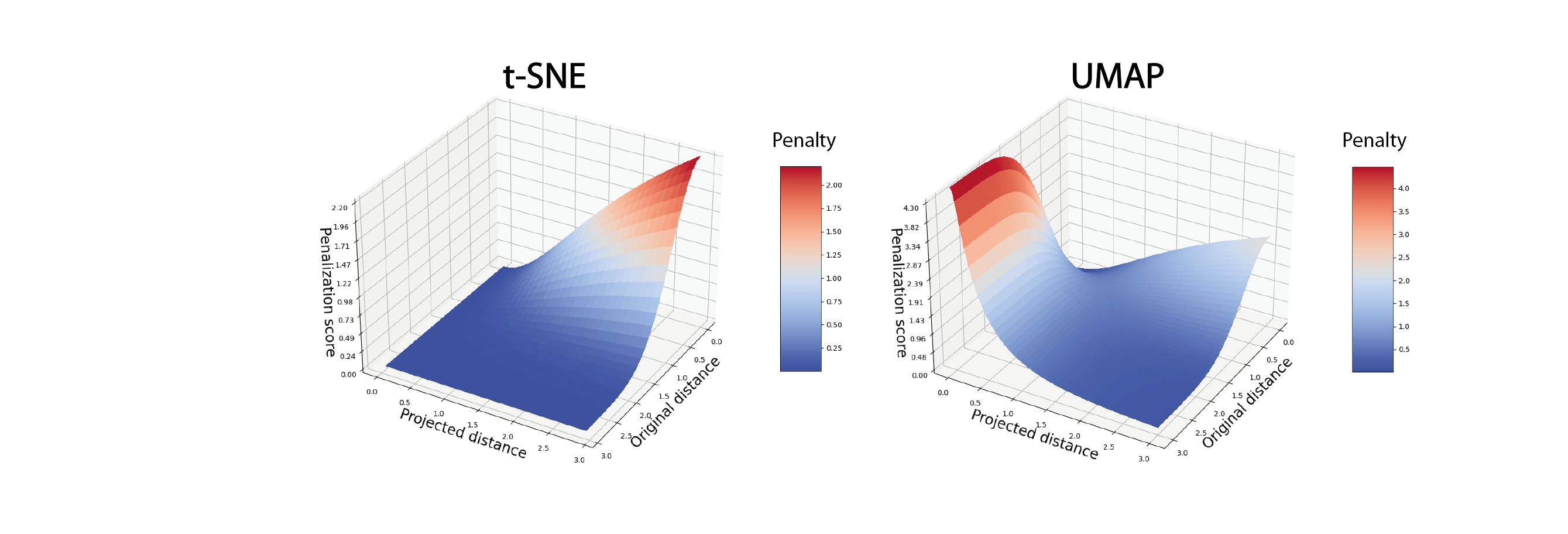
- t-SNE strongly penalizes the situation where short distances in high-dimensional in high-dimensional space are not respected in 2-dimensional space. Conversely, situations where long distances in high-dimensional space are not respected in 2-dimensional space are not penalized. As a result, the t-SNE representation tends to preserve distances between the closest cells (intra-cluster distances) but neglects the conservation of distances between distant cells (inter-cluster distances). As a result, the global structure of the data is ignored in favor of more local structures.
- With t-SNE, both the initialization of the cell projection in 2-dimensional space and the minimization function are based on a stochastic model, i.e. the algorithm can converge on different solutions. Two t-SNE calculated on the same data can therefore produce different representations.
- As minimization is calculated by iteration cell by cell, the t-SNE algorithm is particularly slow to converge on an optimal solution, making it unsuitable for applying it to datasets with tens of thousands of cells.
Compared to t-SNE, the UMAP algorithm penalizes situations where long distances in high-dimensional space are not respected in 2-dimensional space. As a result, the UMAP representation is theoretically better at preserving the overall structure of the original data. Moreover, unlike t-SNE where the balance between local and global structure preservation is empirically adjustable, for UMAP this balance is defined by a number of nearest neighbors, preferably the same as that used for clustering. Overall, the UMAP algorithm is more deterministic in the sense that the final representation is less sensitive to parameter variation. Finally, the main advantage of UMAP over t-SNE is its speed of execution, making it the preferred method for visualizing large datasets.
The t-SNE and UMAP methods are mathematically complex algorithms that have been rapidly adopted in bioinformatics to address the visualization problem posed by high-dimensional data. In the analysis of scRNA-seq data, they are among the inevitable representations for describing the heterogeneity of a dataset or gene expression, both practically and aesthetically. However, their graphic use alone has been widely extrapolated, without taking into account the limits of interpretation imposed by their mathematical foundations. Indeed, the 2-D visualization produced by t-SNE or UMAP is systematically used as a support for data exploration. For example, they are used to identify communities of cells isolated from others, to hypothesize about differentiation trajectories, or to assess the efficiency of dataset normalization and integration, based solely on visual interpretation. However, it has been shown that while these representations partly reflect the topology of the initial data, the drastic reduction in dimensions is accompanied by a massive distortion of the distances between cellular transcriptome profiles. This distortion of spatial relationships applies as much to distances between neighboring cells as to distances between different clusters. Theoretically more respectful of global structures, the UMAP representation is, in reality, no more efficient. In this context, cluster shapes and distances represented in t-SNE or UMAP should never be over-interpreted.
Optional step - Integration of data from independent sequencing experiments
Due to the technical uncertainties involved in collecting, preparing and sequencing the RNA from each sample, data from different experiments generally show a high degree of variability. This variability is even greater when these experiments have been carried out using different protocols and with different experimenters. It is reflected both in the average depth obtained and in particular transcriptomic characteristics, all of which is summarized under the term “batch effect”. Without special treatment and despite depth normalization, these sources of variation are likely to bias the integrated analysis of samples and mask the biological signal of interest. Typically, the main risk is to detect cell communities specific to one sample, whereas they correspond to a cell type or state shared with others. Conversely, over-correcting the data could erase the biological signal, for example by grouping heterogeneous cells within the same cluster. Finding the right correction balance can be complex when the samples to be integrated come from different conditions or diagnostics that induce specific transcriptional variations. Successful integration guarantees correction of the batch effect, while preserving the biological variability of the dataset and requiring the least amount of computational resources. The performances of dozens of integration tools proposed in the literature have been compared according to these same criteria. While these performances appear to be broadly equivalent between approaches, they are above all dependent on the nature of the data to be integrated, notably the total number of cells considered, the complexity of the dataset, the degree of biological and technical variability between samples, or the type of processing applied to the data.
Mistakes to avoid in the first part of the analysis
- Neglecting quality metrics from alignment and quantification
- Choosing quality control filters on count matrices that are too stringent
- Over-correcting data during normalization/transformation or integration
- Annotate biologically irrelevant clusters
- Interpret cell distances from tSNE and UMAP projections
Next article
Single-cell RNA-seq data analysis, Part 2.
Bibliography
Luecken, M. D. & Theis, F. J. Current best practices in single-cell RNA-seq analysis: a tutorial. Mol. Syst. Biol. 15, e8746 (2019)
Zheng, G. X. Y. et al. Massively parallel digital transcriptional profiling of single cells. Nat. Commun. 8, 14049 (2017).
Denisenko, E. et al. Systematic assessment of tissue dissociation and storage biases in single-cell and single-nucleus RNA-seq workflows. Genome Biol. 21, 130 (2020).
Ilicic, T. et al. Classification of low quality cells from single-cell RNA-seq data. Genome Biol. 17, 29 (2016).
Booeshaghi, S., Hallgrímsdóttir, I., Gálvez-Merchán, Á. & Pachter, L. Depth normalization for single-cell genomics count dat. Preprint at https://doi.org/10.1101/2022.05.06.490859 (2022).
Chari, T. & Pachter, L. The Specious Art of Single-Cell Genomics. 2021.08.25.457696 Preprint at https://doi.org/10.1101/2021.08.25.457696 (2022).
Luecken, M.D., Büttner, M., Chaichoompu, K. et al. Benchmarking atlas-level data integration in single-cell genomics. Nat Methods 19, 41–50 (2022).
